Read More
Client:
SHOPRUNNER.COM
Year:
2018 - 2019
Role:
Product Design Lead
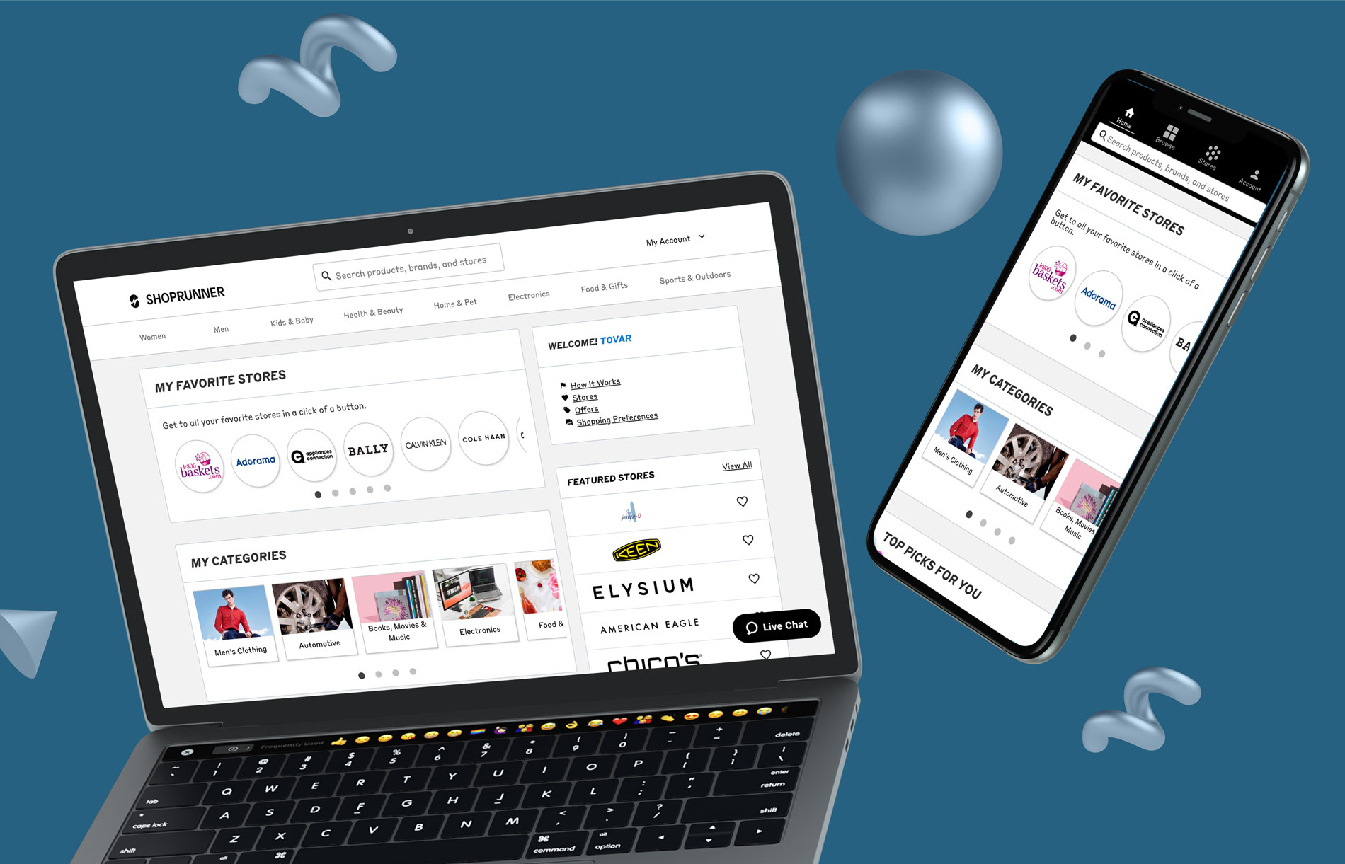
I was the lead product designer on our e-commerce platform Shoprunner.com. Which resulted not only in the launch of the newly branded Shoprunner.com and integrated contentful content system, but also a design language, code library, and user-centered methodology that empowered Shoprunner.com to scale its delivery of exceptional digital experiences.
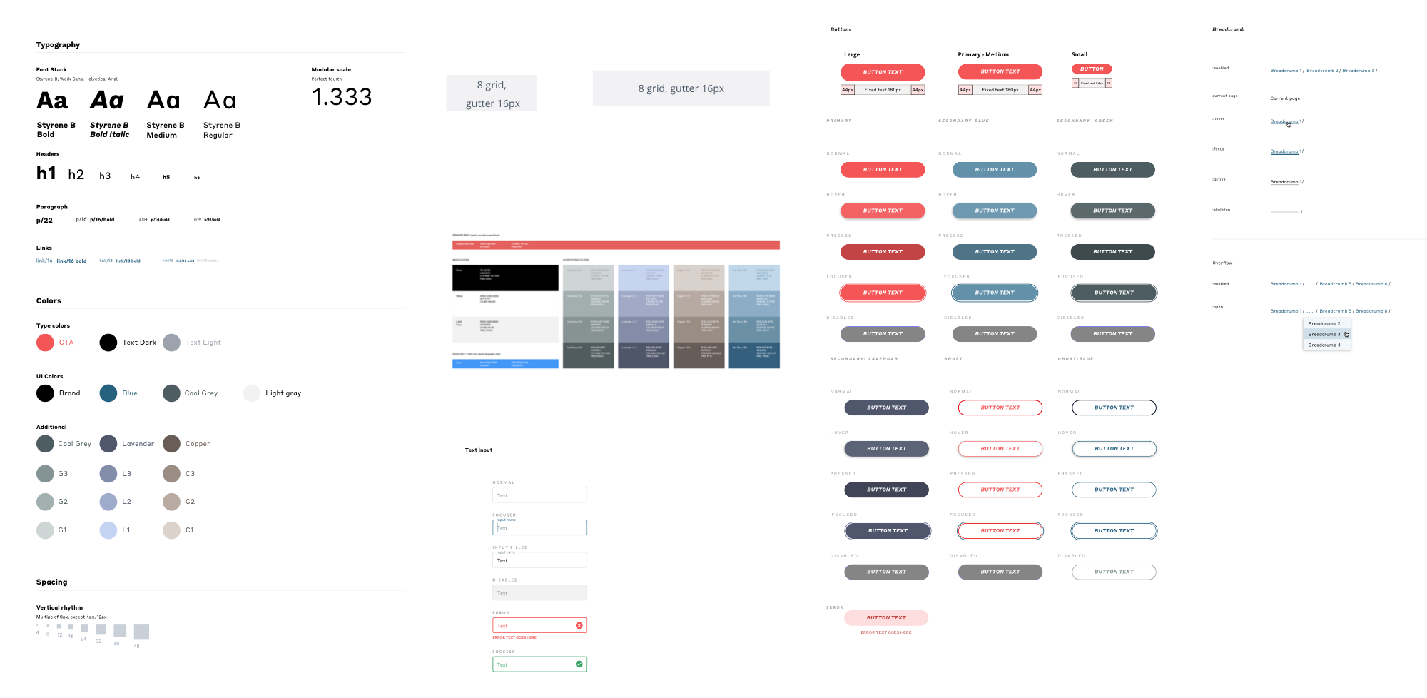
I recognized an opportunity to shape a more consistent digital experience. Together with the CLIF (Customer Lifecycle) Team, I redefined the design principles and interaction model, providing a design language system and a UI Toolkit in the form of reusable desktop and mobile assets.
The new website utilized a Contentful CMS system that pulled in the most recent partner assets, as many of our retail partners updated their assets seasonally. This content update allowed for more design time around feature builds and lighting fast updates to partner content and marketing campaigns.
I implemented a new design sprint, research, and user-testing practices within the product teams. These practices provided insights to inform the iterative approach. The application of user-centered design at Shoprunner has followed an approach that has since played a significant role across the organization.
Problem: Most customers who sign up through our channel partners—such as Amex, Mastercard, and PayPal—don’t end up getting through the on-boarding funnel to the homepage (70%).
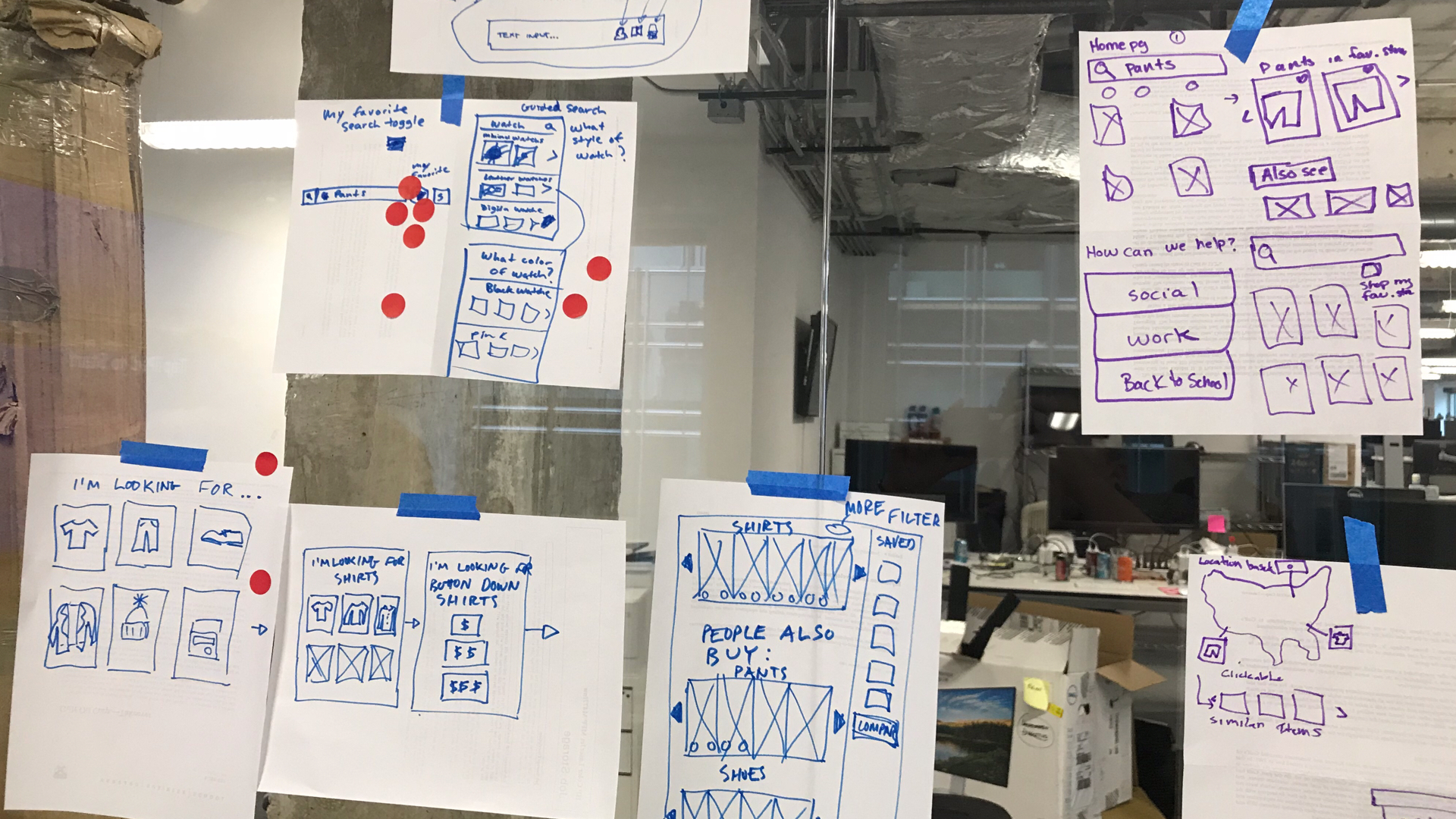
Design Sprint with sketching session:
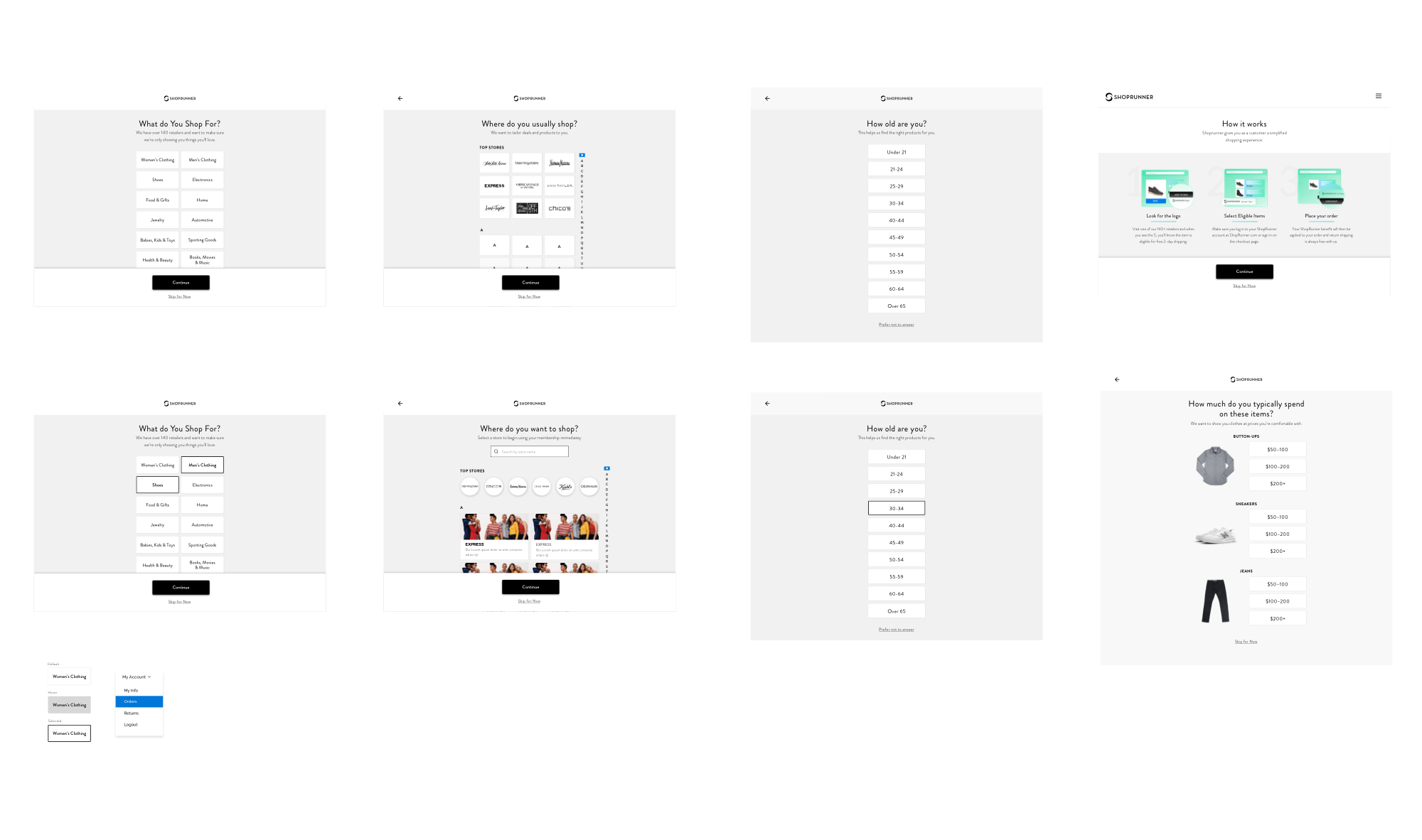
Design Iterations:
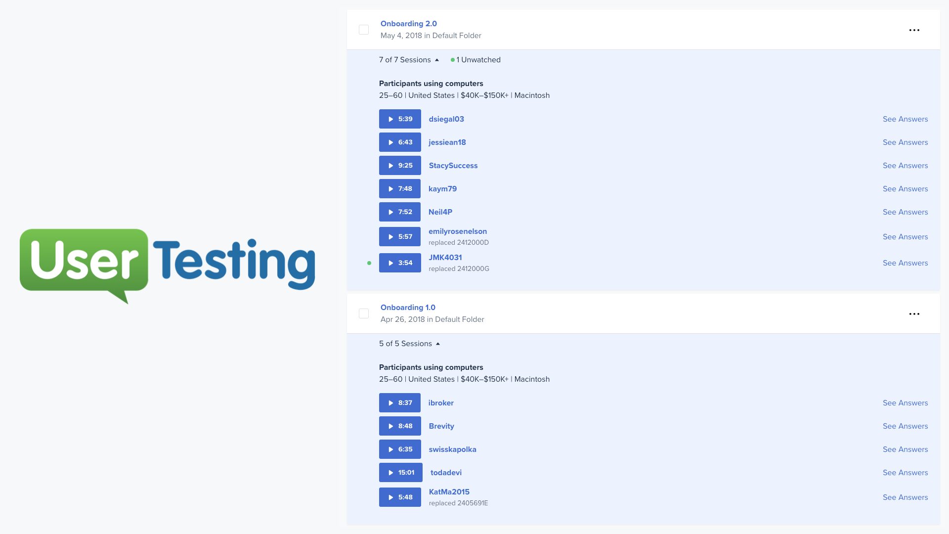
User research and data: I used Usertesting.com to view users going through the on-boarding funnel to see where pain points were. I also used our looker dashboard that had conversion funnel.
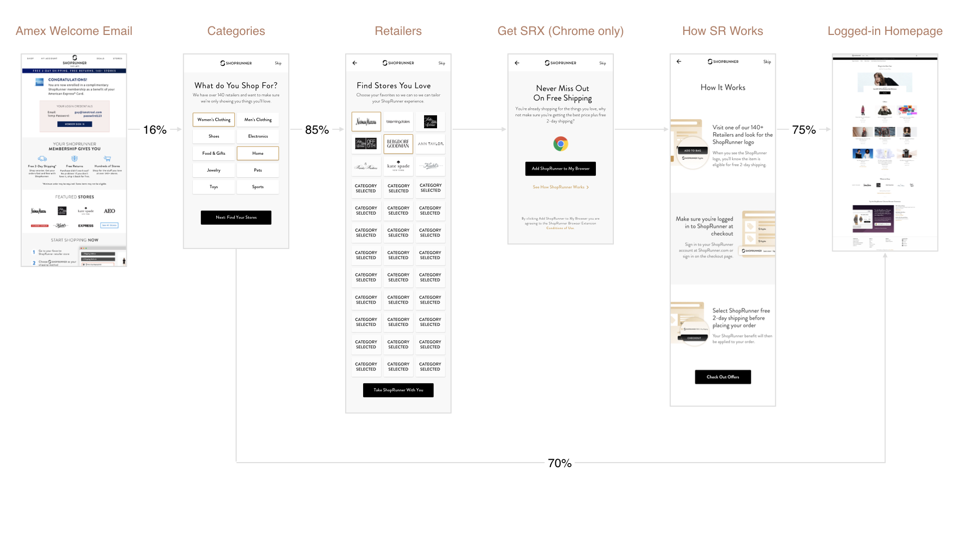
Pain Points: Through user testing and on-boarding funnel metrics we identified several reoccurring pain points.
Solution:
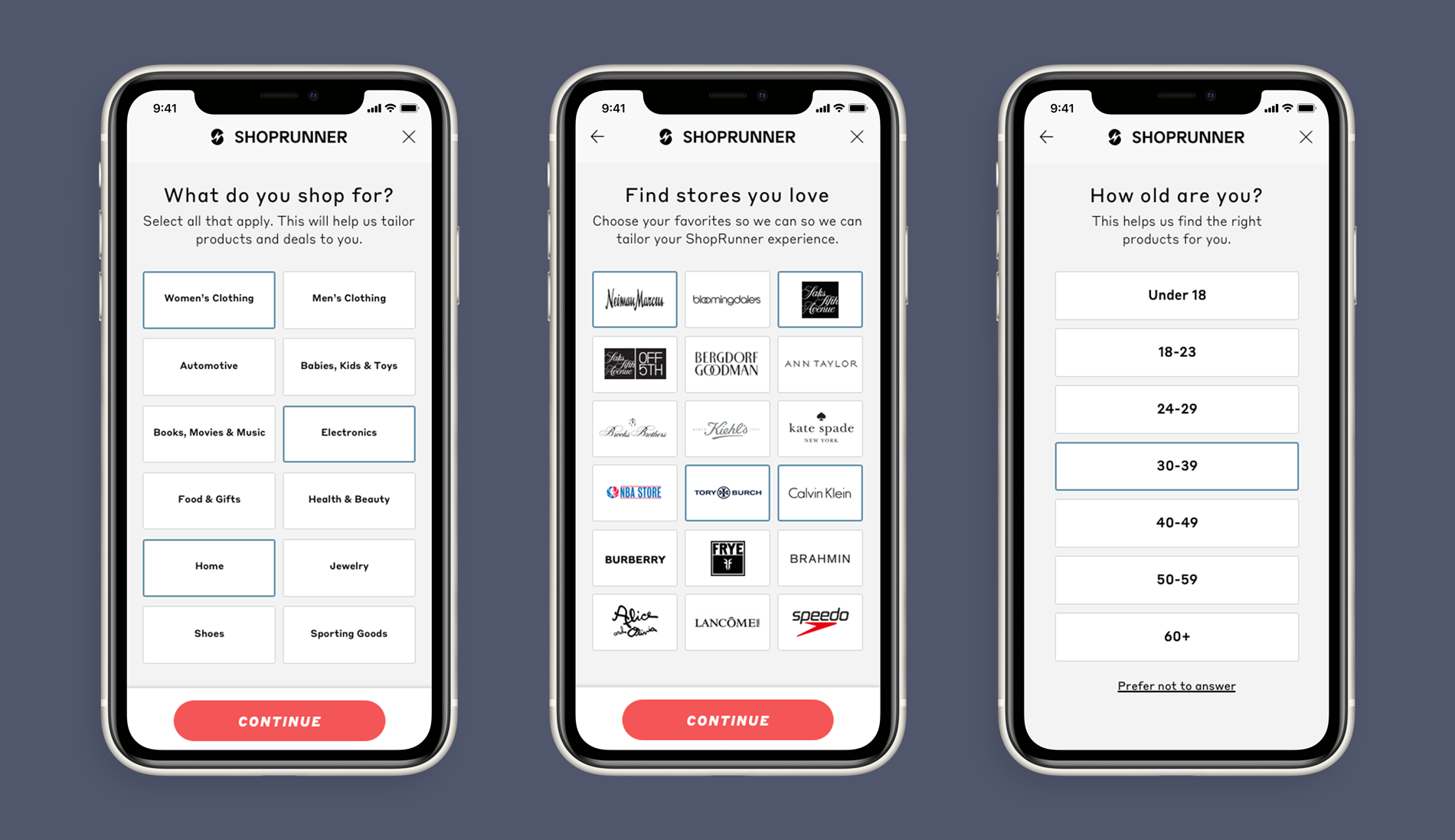
Problem: We had many users that had signed up for a membership but had not actually activated it by using it at a retail partner.
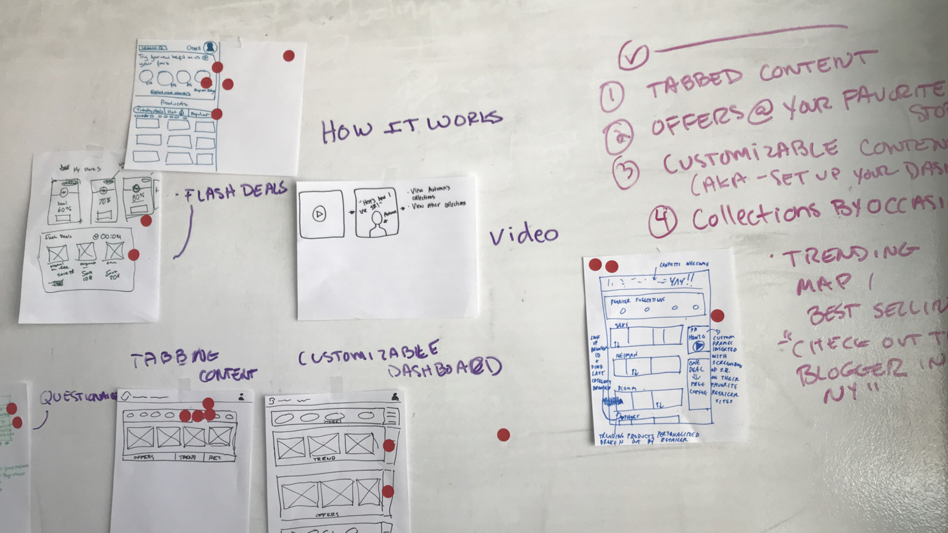
Design Sprint with sketching session:
Design Iterations:
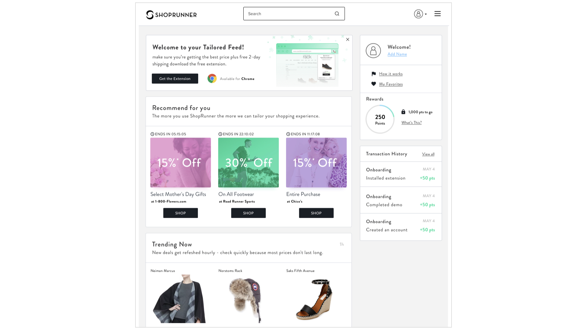
User research and data: Through user testing, activation metrics, and key conversion event data I identified several reoccurring themes.
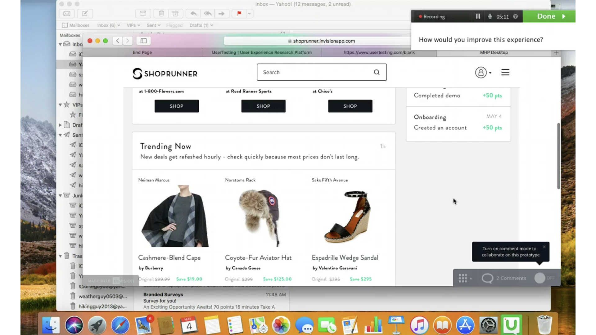
Pain Points: Through user testing.com I learned themes of feedback on the personalized homepage experience.
Solution:
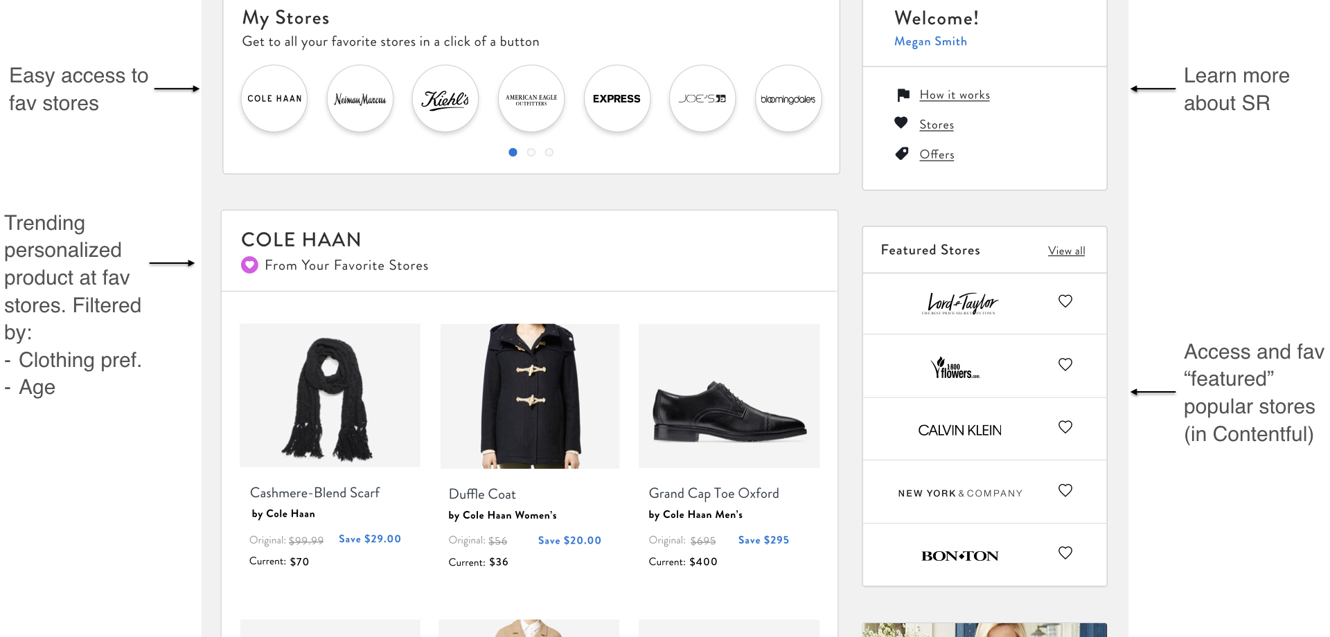
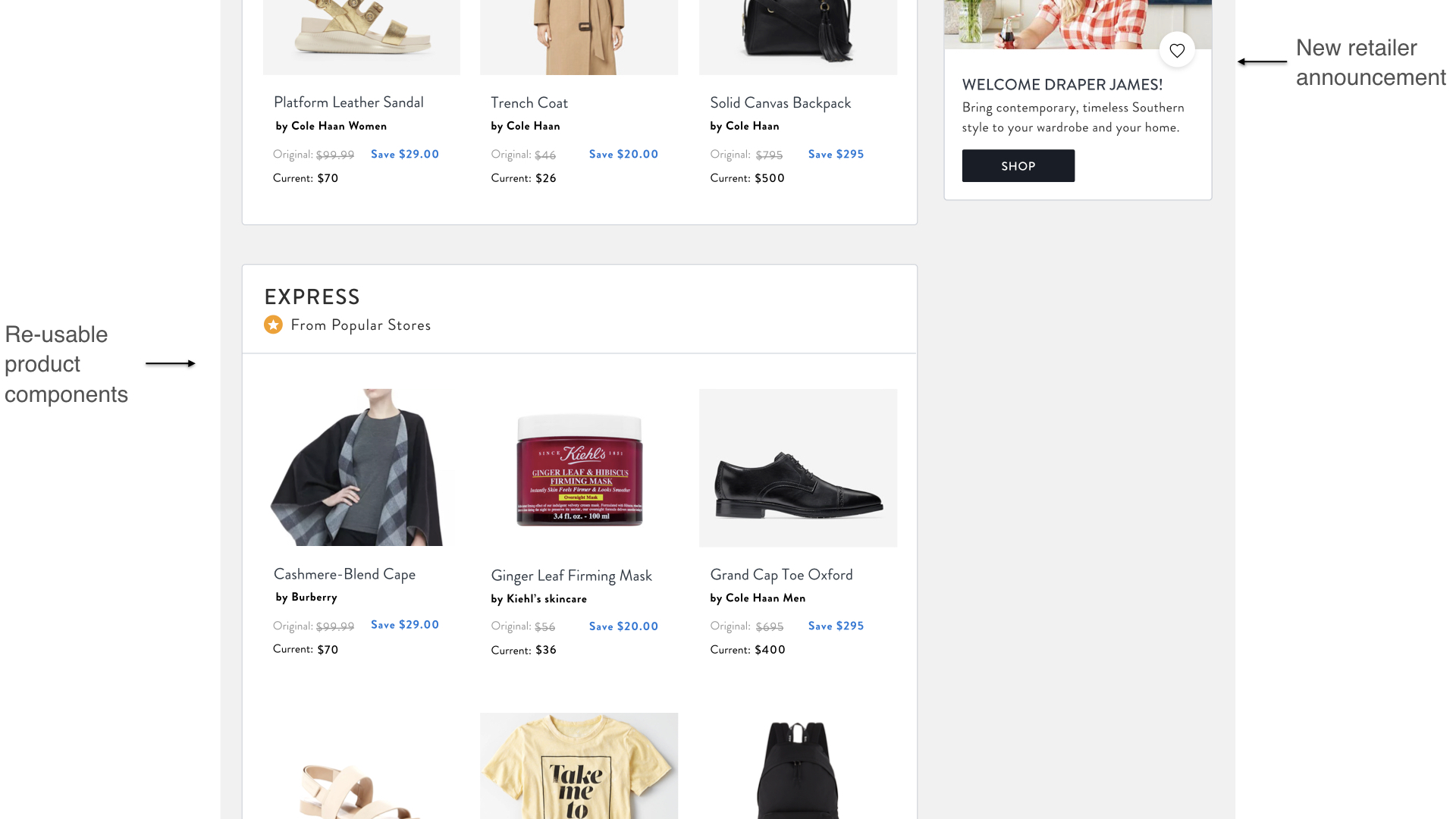
Adding a search feature to Shoprunner.com helped Customers find products they love across the ShopRunner network. Search also drove sales—especially cross-shop and lead to an increase in attributable sales.
We later incorporated the suggested search and similar search. Suggested search is an autocomplete that provided suggestions to users as they enter their search query into the search box. Similar search was a product matching API that used product image similarity data to display similar products across the entire network to Shoprunner users.
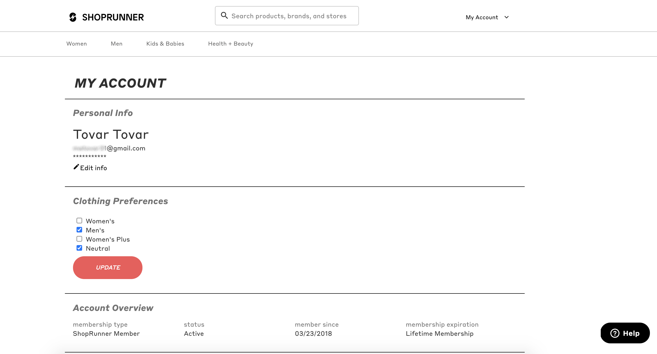
We added many important features to the account page including an address book and payment methods. Also updating ways for a user to change preferences for clothing, and email communications.
Problem: Components for each product at Shoprunner were not a part of a cohesive experience. As a result, users were burdened learning difficult systems and teams were not functioning efficiently.
Goal: We set out to build and sustain a design system called Bolt. Encoded in HTML and CSS, this design system needed to create a visual language and foundational component library to support Shoprunner products and tools complete with documentation available to internal and some components available to retail partners.
Solution: Within the organization, the utilization of the system increased design and development collaboration. It also served to improve efficiency in developing new tools, leading to a more cohesive, higher-quality user experience.
Externally, my team presented a unified, single design system to stakeholders and succeeded in simplifying the most high-profile systems with the potential to touch millions of users. It created a foundation for building accessible and usable products.
